- April 7, 2015
- Posted by: Wevio
- Category: Global Branding & Design, Wevio Blog

As the number of devices increased over the years and the time consumed creating individual outlets for each one increased. Responsive Web Design emerged as a saving grace for many different companies. It was a time saver and more importantly it saved money. Utilizing a Responsive Web Design layout has different layers of purpose. This approaches main purpose is to give a uniform experience for all of your users across all devices.
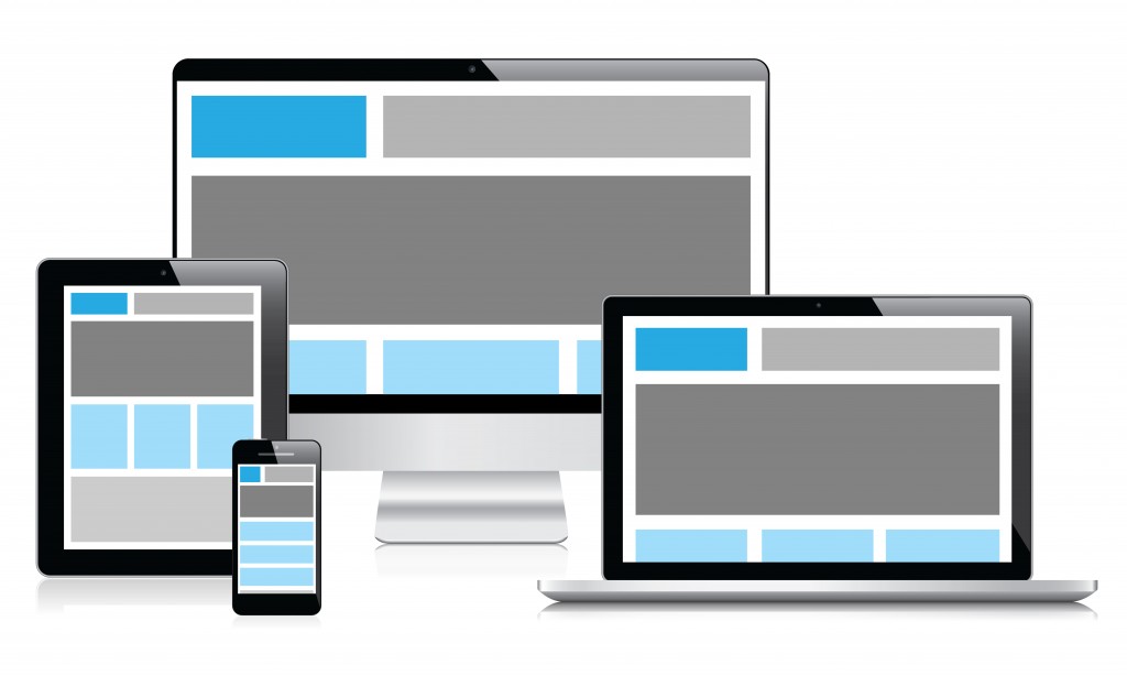
When you do this there are several things you should keep in mind. Responsive Web Design has several different issues that can be easily avoided.
Functionality across Devices
Functionality can follow the size of the device. Sometimes different aspects of a website are lost when it is viewed on Mobile or pad. You should take every step possible to make every part of your website accessible.
User Experience
The way an individual uses a mobile device, a website and a pad are different. Different platforms offer different layouts using a Responsive Web Design. You should consider the different ways an individual might access your website and where to give them an appropriate experience.
Utilizing Fancy Script
If you use complicated scripts like Flash or JS it might provide an excellent experience for a desktop user. This can provide a complication for many mobile users. It can take longer to load and might end up being inaccessible.
More than Layout
Layout is important. However the different functions of a device a website is seen on should be considered. If a person makes a phone call or is watching a movie at the same time on another screen should all be taken into account during the design phase.
Too Much Content
A typical user only give a new website several seconds before they move on if it does not function well. If you give a visitor too many choices they can get confused and ultimately leave your website. Keep in mind how long it takes to get a user to click on the content you want to direct them to.
Considering Device Dimensions
Since a designer or programmer cannot control the device and dimensions our website is viewed. It is necessary to have a flexible and adjustable design that includes break points.
Consider Redesign
If your current website is not compatible across a variety of devices take a different approach. Instead of forcing it to work starting again from scratch might deliver a desired result quicker and with less of a headache.
Designing for Desktop
These days the rule of thumb is to design for mobile, typically the smallest device first. It will result in less redesign work later.
Large Images
The answer is to make sure to optimize your images.
Ignoring Touch
Touch is a huge factor in navigation. Making sure your website can respond to touch especially on mobile devices will improve your user’s experience.