- March 31, 2015
- Posted by: Wevio
- Category: Sales & Marketing, Wevio Blog

Mobile commerce is growing very fast. As per the eMarketer report, mobile-driven online sales in the U.S reached $2.12 billion in 2013 and to $62.2 billion in the next three years. And this goes without saying that mobile apps will be playing a very important role in this phenomenal development. Therefore, business owners are moving fast and working towards creating mobile applications to get their business into the hands of customers. 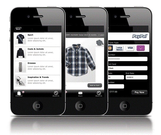 Having an understanding of the impact of mobile-commerce and the respective applications, it is important that the approach for building a mobile-commerce application should be well thought out, thorough and focused. Some important considerations are: Define the vision: Firstly, examine your organizational goals because they will decide your future roadmap that can take you ahead of your competition. Once you have the goals in place, evaluate the pros and cons, prioritize, and work on it. Decide the technology platforms: The future of the application will depend on the success of the platform on which it runs. Also, the technical capabilities may differ based on this choice. Android and iOS are the two most popular platforms, with Window 8 and Blackberry far behind. Therefore you would definitely want to include them in your strategy. Develop and test for the Android and iOS, including the resolutions of both the phones and tablets. Choice of language: Having your product in only one language effectively limits your consumer base to the people who can understand it. Be cognizant of this fact, and unless you want to target only a specific group of individuals, create multiple choices for language. Think about the ecosystem: Remember, your application does not work in isolation. You need a financial ecosystem to execute transactions. One of the critical components of the ecosystem is the payment gateway; you need to ensure proper integration for smooth operations. Design for performance and usability: The mobile site needs to be optimized for smart phones and tablets. The layout should be simple and user friendly. Also, the site should be responsive which means it should change size and layout in response to the user’s device. The interface should be simple and easy to navigate on small screens. Test thoroughly: This is the last and the most crucial part in creating your app. Spend time with your target audience to ensure you understand their needs and whether it is working as per their expectations. The fragmentation of devices is a major challenge here. Different specs and resolutions may make your site behave erratically. Therefore, testing is very important.